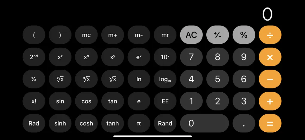
I’m building a calculator in SwiftUI as a practice project, and calculator buttons have a particular feel: they share a uniform aspect ratio, expand to fill available space, and behave predictably. While experimenting with the layout, I ended up going through three distinct stages of “button making” in SwiftUI. Each stage solved a different problem, and each one taught me more about how SwiftUI wants you to structure interactive views.
Stage 1 - Custom view with a tap gesture
I began with a plain RoundedRectangle because layout and visual proportion mattered more than functionality at this point. To make something feel button-like, you can simply attach .onTapGesture { } to any view.
struct CalculatorButtonStage1: View {
    let title: String
    let action: () -> Void

    var body: some View {
        RoundedRectangle(cornerRadius: 12)
            .fill(Color.gray.opacity(0.2))
            .overlay(
                Text(title)
                    .font(.title)
                    .foregroundColor(.primary)
            )
            .aspectRatio(1, contentMode: .fit)
            .onTapGesture {
                action()
            }
    }
}

CalculatorButtonStage1(title: "7") {
    print("Tapped 7")
}
You get maximum visual control over the views, but this comes with some trade-offs:
- Doesn’t participate in button semantics
- No automatic accessibility behavior
- No built-in interaction states (pressed, disabled, etc.)
A custom view with a tap gesture is appropriate when the element is not really a “button” in the semantic sense but still needs to react to taps. For a calculator, though, these rectangles were starting to act like buttons, so lets make them a button.
Stage 2 - Button with a custom label
The next natural move was to wrap the visuals inside SwiftUI’s Button. A button’s label is just a view builder, so you can provide any shape, stack, or custom drawing you want. Now the calculator buttons get the benefits of being buttons:
- Gets system behaviors like accessibility, focus, hover, and keyboard activation
- Press states can be handled using gestures inside the label if needed
struct CalculatorButtonStage2: View {
    let title: String
    let action: () -> Void

    @State private var isPressed = false

    var body: some View {
        Button(action: action) {
            RoundedRectangle(cornerRadius: 12)
                .fill(isPressed
                      ? Color.gray.opacity(0.35)
                      : Color.gray.opacity(0.2))
                .overlay(
                    Text(title)
                        .font(.title)
                        .foregroundColor(.primary)
                )
                .aspectRatio(1, contentMode: .fit)
                .scaleEffect(isPressed ? 0.97 : 1)
                .animation(.easeOut(duration: 0.12), value: isPressed)
                // Track press state manually
                .gesture(
                    DragGesture(minimumDistance: 0)
                        .onChanged { _ in
                            if !isPressed {
                                isPressed = true
                            }
                        }
                        .onEnded { _ in
                            isPressed = false
                        }
                )
        }
        // Avoid the default button style fighting with the custom visuals
        .buttonStyle(.plain)
    }
}

CalculatorButtonStage2(title: "7") {
    print("Tapped 7")
}
Manaually managing the pressed state is messy. A button with a custom label seem best suited for when you want to make a one-off button and not a bunch of the same kind of buttons.
Stage 3 - Button with a custom button style
For a calculator, every button needs to look and behave consistently. This is where ButtonStyle becomes the right tool. It allows styling logic to live in one place while offering a clean, reusable API at the call site.
Advantages:
- Centralized styling
- Automatic pressed/dimmed states
- Makes it easy to apply consistent button design throughout an app
- Keeps the calling site clean
struct CalculatorButtonStyle: ButtonStyle {
    func makeBody(configuration: Configuration) -> some View {
        RoundedRectangle(cornerRadius: 12)
            .fill(configuration.isPressed
                  ? Color.gray.opacity(0.35)
                  : Color.gray.opacity(0.2))
            .overlay(
                configuration.label
                    .font(.title)
                    .foregroundColor(.primary)
            )
            .aspectRatio(1, contentMode: .fit)
            .scaleEffect(configuration.isPressed ? 0.97 : 1)
            .animation(.easeOut(duration: 0.12), value: configuration.isPressed)
    }
}

Button("7") {
    print("Tapped 7")
}
.buttonStyle(CalculatorButtonStyle())
This is the correct choice when you want a design system, not just a single custom button. Once the calculator grew past a single demo button, the ButtonStyle approach made the layout simpler, more scalable, and easier to maintain.
SwiftUI offers multiple ways to build a “button,” and I think I ended up using all of them while prototyping this calculator layout. What began as simple tappable views eventually evolved into a reusable ButtonStyle. The progression highlights how SwiftUI guides you from quick sketches to a proper design system.
